
MallokMallok

BrandBrand kit v0.2

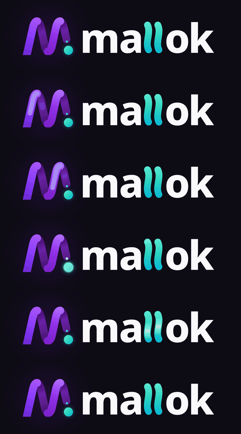
The Kinetic Thread M.

Mallok's logo, favicon set, colours and type, with the rules for using them. Every file on this page is a copy from the brand kit and can be downloaded as it is.

01Concept

One unbroken thread, and one dot that travels.

The initial M is drawn as a single continuous thread, standing for the seamless serverless flow of a site that runs on Cloudflare Workers, D1 and R2. The only teal element, the shuttle dot at the lower right, answers the two flowing l's in the wordmark.

Together they tell the product's story: no operations, content woven live the moment it is saved, and Markdown that is free to leave.


The Mallok mark: a purple ribbon M with a teal dot

03Favicon and social

The small sizes have their own artwork.

Between 16 and 32 pixels, always use the files from the favicon set rather than scaling the mark down. This site uses the set as supplied.

favicon 16pxfavicon 32pxfavicon 48px
16 · 32 · 48 pxsmall-size artwork
favicon 16pxfavicon 32pxfavicon 48px
16 · 32 · 48 pxon dark
Apple touch icon
App icon180 px
Open Graph share image
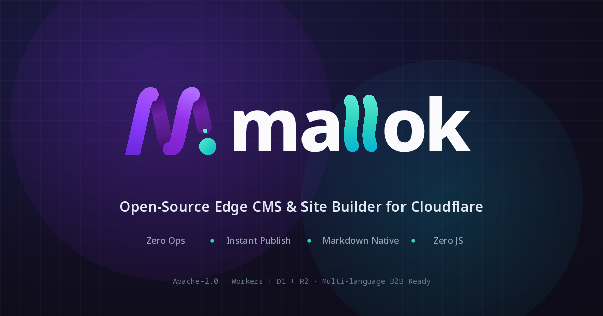
Share image1200×630 ↓

Also in the kit: a 512 px avatar (PNG), README headers for light and dark (light, dark) and four looping GIFs (logo light, logo dark, mark, loader). The GIFs are linked rather than shown, so nothing on this page moves on its own.

04Usage

How to use it, and the red lines.

How to use

  • Clear space: keep at least one shuttle-dot diameter free on every side of the logo.
  • Minimum size: the full logo at least 96 px wide on screen; the mark at least 16 × 16 px.
  • From 16 to 32 px, use the versions in the favicon set, which are drawn for small sizes.
  • Pick the file for the background: colour-light or mono-light on light; colour-dark, accent-dark or mono-dark on dark.
  • Teal is the one story accent: the shuttle dot, the double l, and “instant” status. Use it sparingly.

Things to avoid

  • Do not put the M on a rounded tile or any other container. The only exception is the iOS and Android app icons.
  • Do not stretch or distort the logo.
  • Do not change the balance of teal and purple, or recolour either.
  • Do not use Electric Teal (#06B6D4) or #0D9488 for small text on light backgrounds; they are below 4.5:1 there. This site uses --live (#0f766e) for teal text.

05Colour

Cloud White, Midnight ink, purple to act, teal for live.

The site is light first. Purple is the brand and action colour. Teal appears only where something is live or instant; amber marks what needs a redeploy. The scales below are derived from the kit's colours, and pages use the semantic tokens only.

The kit's colours

Kinetic Purple#7E22CE--mallok-purpleon white 7.0:1 · on Midnight 2.8:1
Ribbon Highlight#A855F7--mallok-purple-lighton white 4.0:1 · on Midnight 4.9:1
Ribbon Fold#581C87--mallok-purple-deepon white 10.9:1 · on Midnight 1.8:1
Electric Teal#06B6D4--mallok-tealon white 2.4:1 · on Midnight 8.0:1
Mint Glow#2DD4BF--mallok-teal-brighton white 1.9:1 · on Midnight 10.5:1
Teal for light backgrounds#0D9488--mallok-teal-lightbgon white 3.7:1 · on Midnight 5.2:1
Midnight Deep#0D0B14--mallok-midnighton white 19.5:1 · on Midnight 1.0:1
Cosmic Blue#1E1B4B--mallok-cosmicon white 16.0:1 · on Midnight 1.2:1
Cloud White#FBFAFC--mallok-cloudon white 1.0:1 · on Midnight 18.8:1

Thread gradient

--mallok-gradient-thread

Shuttle gradient

--mallok-gradient-shuttle

Purple — 700 is Kinetic Purple, 500 the highlight, 900 the fold

--purple-<step>

Teal — 400 is Mint Glow, 600 the kit's light-background teal, 700 is used for text

--teal-<step>

Neutral — violet-tinted, from Cloud White to Midnight

--neutral-<step>

Green — success

--green-<step>

Amber — warning

--amber-<step>

Red — danger

--red-<step>

Semantic tokens and their light and dark values

TokenLightDarkRole
--paper#fbfafc#0d0b14Page background (Cloud White / Midnight)
--paper-2#f6f3fa#14111cTinted section
--surface#ffffff#17141fCards, raised surfaces
--ink#0d0b14#fbfafcHeadings, primary text
--ink-2#29253a#d9d5e3Body text on surfaces
--muted#55506b#b4aec6Secondary text
--faint#686279#9d97b2Labels, captions
--line#e6e0f0#2a2538Hairlines
--line-strong#c9c4d4#3d3650Control borders
--accent#7e22ce#c99bfbLinks, numerals, purple text
--accent-ink#ffffff#0d0b14Text on accent
--accent-deep#6b21a8#d8b4feHover / pressed link
--accent-tint#f4eefc#211a33Lavender wash: badges, table heads, callouts
--action#7e22ce#a855f7Primary button, thread lines (Kinetic Purple / Ribbon Highlight)
--action-deep#6b21a8#c084fcPrimary button, hover
--action-ink#ffffff#0d0b14Text on the primary button
--live#0f766e#2dd4bfStory accent text: live, instant, cache HIT
--live-line#0d9488#2dd4bfTeal lines and stops (graphics, 3:1)
--live-tint#e6faf6#0e2527Live background
--code-bg#f6f2fc#14111cCode panel background
--code-ink#0d0b14#fbfafcCode text
--code-key#7e22ce#c99bfbCode keys
--code-str#0f766e#5eead4Code strings
--code-dim#5f5a75#9d97b2Code comments, prompts
--success#15803d#4ade80Positive
--success-tint#dcfce7#0f2a1bSuccess background
--warning#92400e#fbbf24Cache MISS, caution
--warning-tint#fef3c7#33260fWarning background
--danger#b91c1c#fca5a5Errors, destructive
--danger-tint#fee2e2#3b1614Danger background
--info#7e22ce#c99bfbInformational (same as accent)
--info-tint#f4eefc#211a33Info background

06Contrast

Every text pair the site uses, measured.

WCAG 2 contrast ratios, computed from the token values when this page is built. AA for normal text needs 4.5:1; AAA needs 7:1.

Text on backgroundLightDark
--ink on --paperAa 文18.77:1 AAAAa 文18.77:1 AAA
--ink on --surfaceAa 文19.53:1 AAAAa 文17.45:1 AAA
--ink-2 on --surfaceAa 文14.79:1 AAAAa 文12.61:1 AAA
--ink-2 on --paper-2Aa 文13.46:1 AAAAa 文12.94:1 AAA
--ink on --accent-tintAa 文17.19:1 AAAAa 文16.01:1 AAA
--ink on --live-tintAa 文18.02:1 AAAAa 文15.38:1 AAA
--ink-2 on --accent-tintAa 文13.02:1 AAAAa 文11.57:1 AAA
--muted on --paperAa 文7.35:1 AAAAa 文9.13:1 AAA
--muted on --surfaceAa 文7.65:1 AAAAa 文8.48:1 AAA
--muted on --paper-2Aa 文6.96:1 AAAa 文8.71:1 AAA
--muted on --accent-tintAa 文6.73:1 AAAa 文7.78:1 AAA
--faint on --paperAa 文5.59:1 AAAa 文6.98:1 AA
--faint on --surfaceAa 文5.81:1 AAAa 文6.49:1 AA
--faint on --paper-2Aa 文5.29:1 AAAa 文6.66:1 AA
--accent on --paperAa 文6.71:1 AAAa 文8.90:1 AAA
--accent on --surfaceAa 文6.98:1 AAAa 文8.27:1 AAA
--accent on --paper-2Aa 文6.36:1 AAAa 文8.49:1 AAA
--accent-ink on --accentAa 文6.98:1 AAAa 文8.90:1 AAA
--accent on --accent-tintAa 文6.15:1 AAAa 文7.59:1 AAA
--action-ink on --actionAa 文6.98:1 AAAa 文4.94:1 AA
--action-ink on --action-deepAa 文8.72:1 AAAAa 文7.39:1 AAA
--live on --paperAa 文5.26:1 AAAa 文10.49:1 AAA
--live on --surfaceAa 文5.47:1 AAAa 文9.76:1 AAA
--live on --paper-2Aa 文4.98:1 AAAa 文10.01:1 AAA
--live on --live-tintAa 文5.05:1 AAAa 文8.59:1 AAA
--code-ink on --code-bgAa 文17.70:1 AAAAa 文17.91:1 AAA
--code-key on --code-bgAa 文6.33:1 AAAa 文8.49:1 AAA
--code-str on --code-bgAa 文4.96:1 AAAa 文12.60:1 AAA
--code-dim on --code-bgAa 文5.93:1 AAAa 文6.66:1 AA
--muted on --code-bgAa 文6.93:1 AAAa 文8.71:1 AAA
--success on --surfaceAa 文5.02:1 AAAa 文10.42:1 AAA
--success on --success-tintAa 文4.57:1 AAAa 文8.81:1 AAA
--warning on --surfaceAa 文7.09:1 AAAAa 文10.88:1 AAA
--warning on --warning-tintAa 文6.37:1 AAAa 文8.83:1 AAA
--danger on --surfaceAa 文6.47:1 AAAa 文9.57:1 AAA
--danger on --danger-tintAa 文5.30:1 AAAa 文8.44:1 AAA
--info on --info-tintAa 文6.15:1 AAAa 文7.59:1 AAA
--paper on --inkAa 文18.77:1 AAAAa 文18.77:1 AAA

07UI language

How the logo becomes an interface.

The ribbon becomes the threads that connect cards and diagram nodes. Its rounded ends become pill buttons and rounded cards. The shuttle dot marks status, list items and the current page. The wordmark's twin l becomes paired things: the two timelines, EN and 中文.

80% neutral, 15% Kinetic Purple for actions and threads, 5% Electric Teal for one story only: live, instant, arrived. Teal is never a second button colour.

Primary Secondary 0.1 release candidate Live immediately Build + redeploy
npx mallok create my-site

The full design board: components, states and tokens

08Type

Figtree for Latin text, system fonts for Chinese and code.

Figtree's 800 weight is the closest match to the wordmark's heavy geometric lowercase, and its 400 reads well as body text. The font files are not in /assets/fonts/ yet, so this build shows the system fallback; no request leaves the site either way. Chinese uses PingFang SC, Microsoft YaHei and Noto Sans SC; code uses each platform's monospace. Neither loads a web font.

--sans · headings and body

Content needs no build.

The frame does.

Mallok is the Cloudflare-native CMS and website builder for multilingual B2B websites. 多语言 B2B 网站的建站工具。

--mono · labels, code, catalogue numbers

npx mallok create my-site

01Section label

--serif · reserved for quotations and long-form accents; not used in the interface

Publish at the edge, keep the Markdown.

--step--113px · fine print
--step-016px · body
--step-118px · lede
--step-220–24px · card titles
--step-326–38px · section titles
--step-434–60px · hero

One command. Your account. Your content.

Mallok creates a Worker, a D1 database and an R2 bucket in your own Cloudflare account and deploys the site there. Nothing is hosted by Mallok, and there is no Mallok account to open.

npx mallok create my-site

Needs Node.js 22+ and wrangler login. Add --no-deploy to generate and check a project locally without creating cloud resources. Currently a 0.1 release candidate.